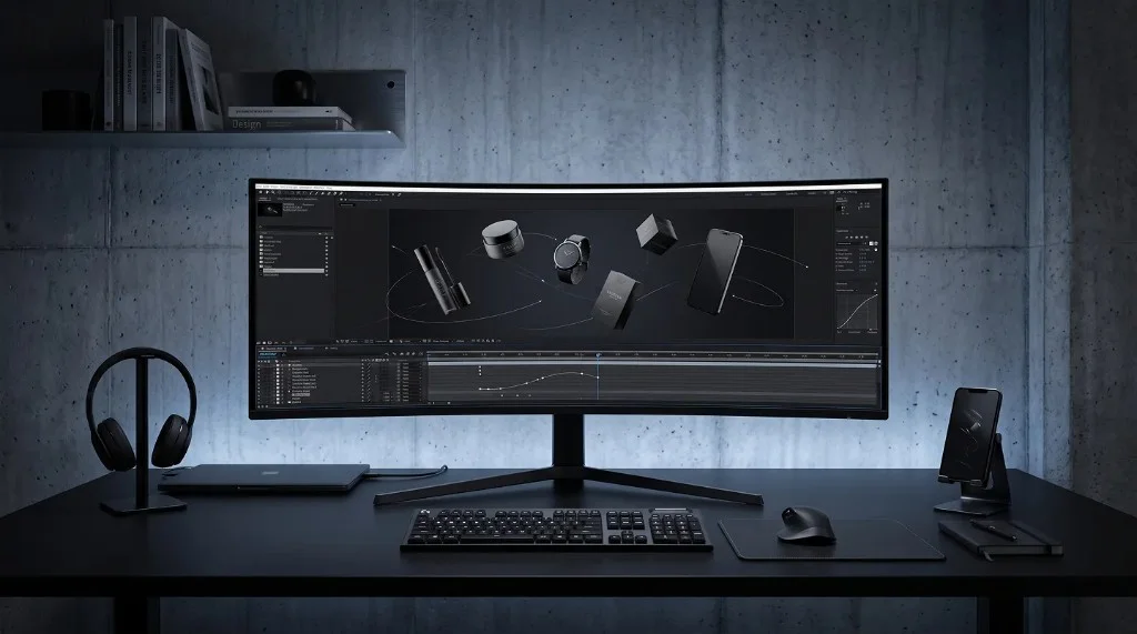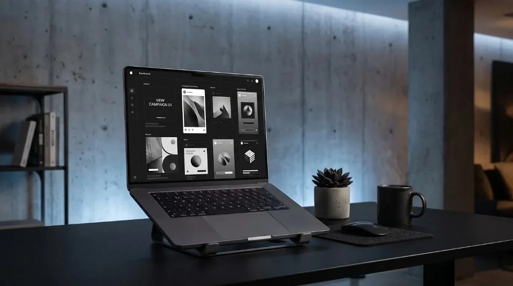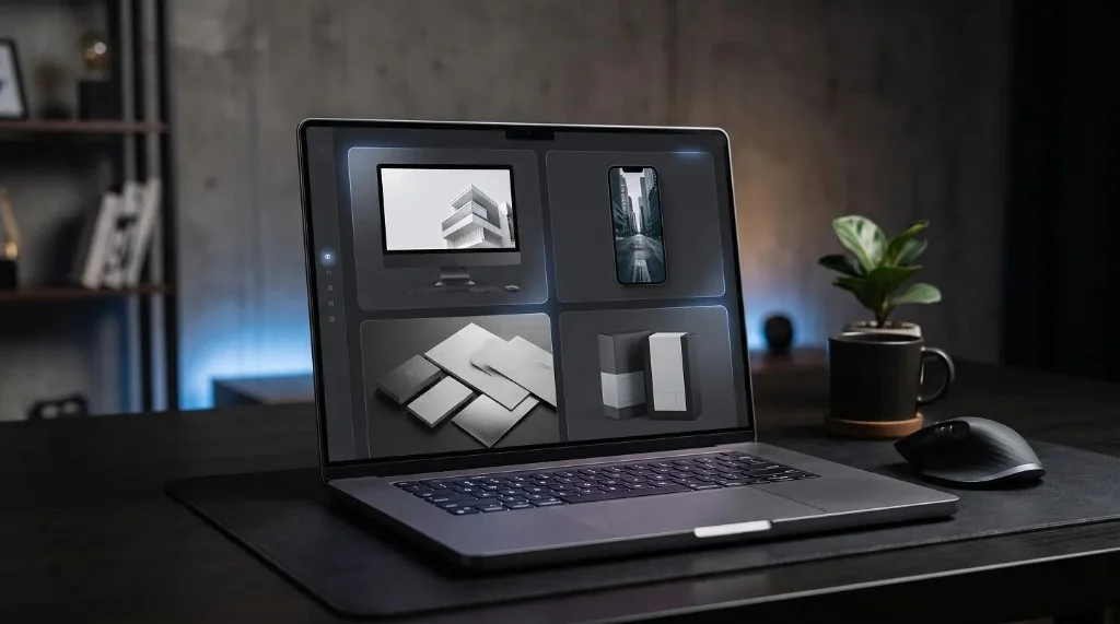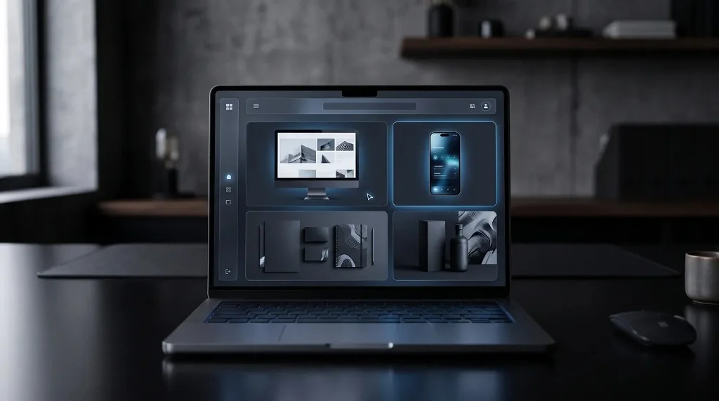
A product mockup is simple at its core: take something real — a screenshot, a design, or a screen recording — and place it inside a clean device frame with a simple background and consistent lighting. That’s the entire formula behind most professional-looking mockups, whether static or animated. No design software or complex editing setup is required to get there.
What a Product Mockup Actually Does
A product mockup places a design inside a realistic setting, usually a device frame like a phone, tablet, or laptop. Instead of showing a flat image on its own, the mockup gives that image context: this is what it looks like on a real screen, held in real hands, used in a real environment.
That context is often what separates something that looks like a rough draft from something that looks like a finished product.
The Simple Formula Behind Every Good Mockup
Most effective product mockups follow the same basic structure:
- A clean device frame — phone, laptop, tablet, or browser window
- The actual design or content — placed accurately inside the screen area
- A simple, uncluttered background — so attention stays on the product, not the surroundings
- Consistent lighting and perspective — so the mockup feels natural rather than artificially pasted together
None of these steps require advanced design skills. They require attention to a few basic details, applied consistently.
Static vs Motion Mockups
A static mockup is often enough to make a design look polished, but motion mockups take the effect further by showing the product in use — a screen scrolling, a button being tapped, an interface transitioning between states. This gives viewers a much clearer sense of the actual experience, not just the appearance.
For anything meant to demonstrate functionality, like an app or a website, motion mockups tend to communicate value faster than static ones.
Avoiding Common Mockup Mistakes
A few habits can make mockups look less polished than they should:
- Overly busy backgrounds that compete with the product itself
- Mismatched lighting or shadows that make the device frame feel disconnected from the content
- Low-resolution screenshots stretched to fit a larger frame
- Inconsistent styles across a set of mockups meant to be shown together
Keeping things simple almost always produces a cleaner result than trying to make a mockup overly elaborate.
Where Simple Mockups Make the Biggest Difference
Product mockups are especially valuable in a few common situations:
- App store previews, where a clean mockup can make an interface instantly understandable
- Landing pages, where a mockup replaces a plain screenshot with something more inviting
- Social media posts, where a well-framed mockup stands out in a feed of plain images
- Client presentations, where a polished mockup signals professionalism before a single word is spoken
Frequently Asked Questions
What’s the minimum needed for a good product mockup?
A clean device frame, the actual design placed accurately inside it, a simple background, and consistent lighting and perspective.
Should I use a static or motion mockup?
Use a static mockup for quick, at-a-glance presentation. Use a motion mockup when you need to show the product actually being used, like scrolling or tapping.
What’s the most common mockup mistake?
Busy backgrounds that compete with the product itself, along with mismatched lighting or low-resolution screenshots stretched to fit a larger frame.
Do I need design software to make a product mockup?
No. Tools like the Frametion app turn screenshots and screen recordings into finished mockups without any manual setup.
Putting the Simple Formula to Work
A great product mockup doesn’t need to be complicated — it just needs the right frame, the right context, and a bit of consistency. Once those basics are in place, even a simple screenshot can look like a fully finished product. For anyone who wants to skip the manual setup entirely, the Frametion app turns screenshots and screen recordings into clean, professional mockups in just a few clicks.