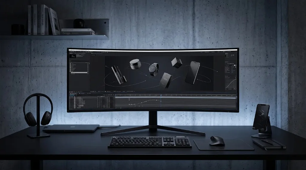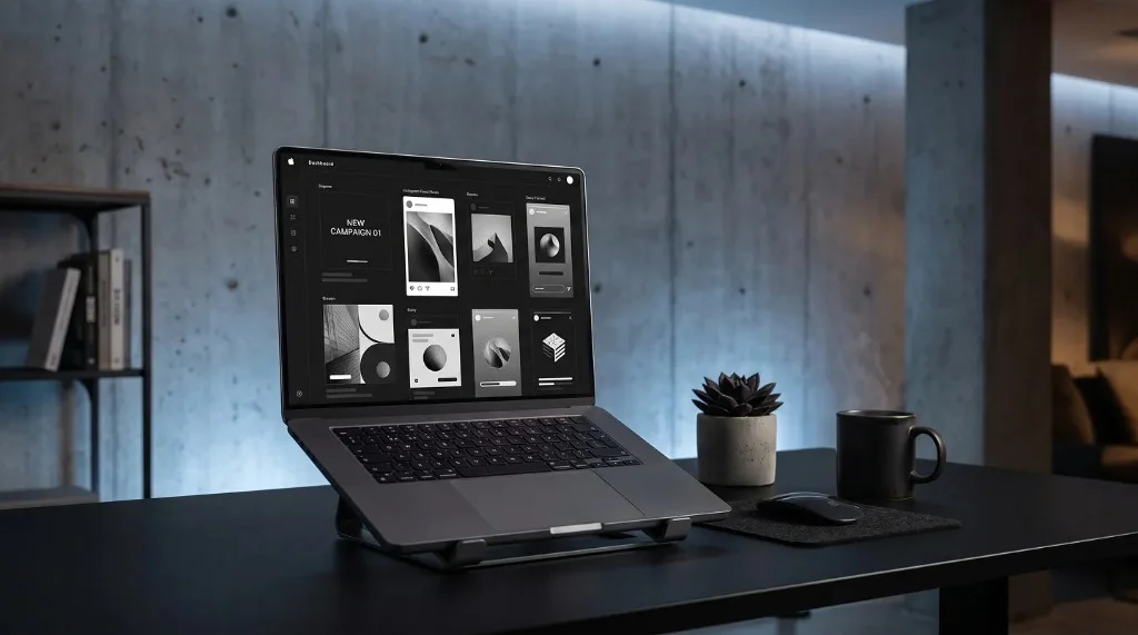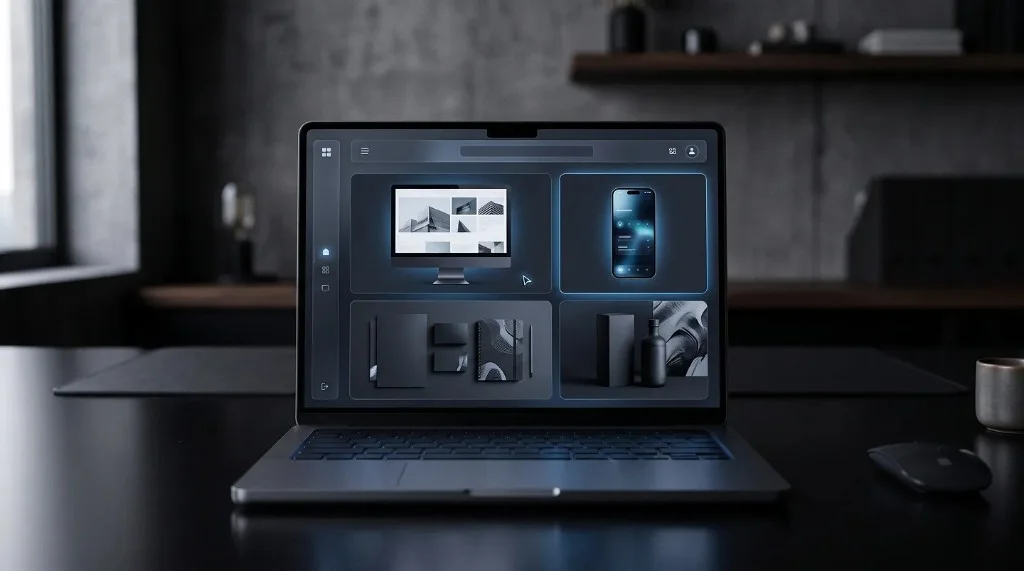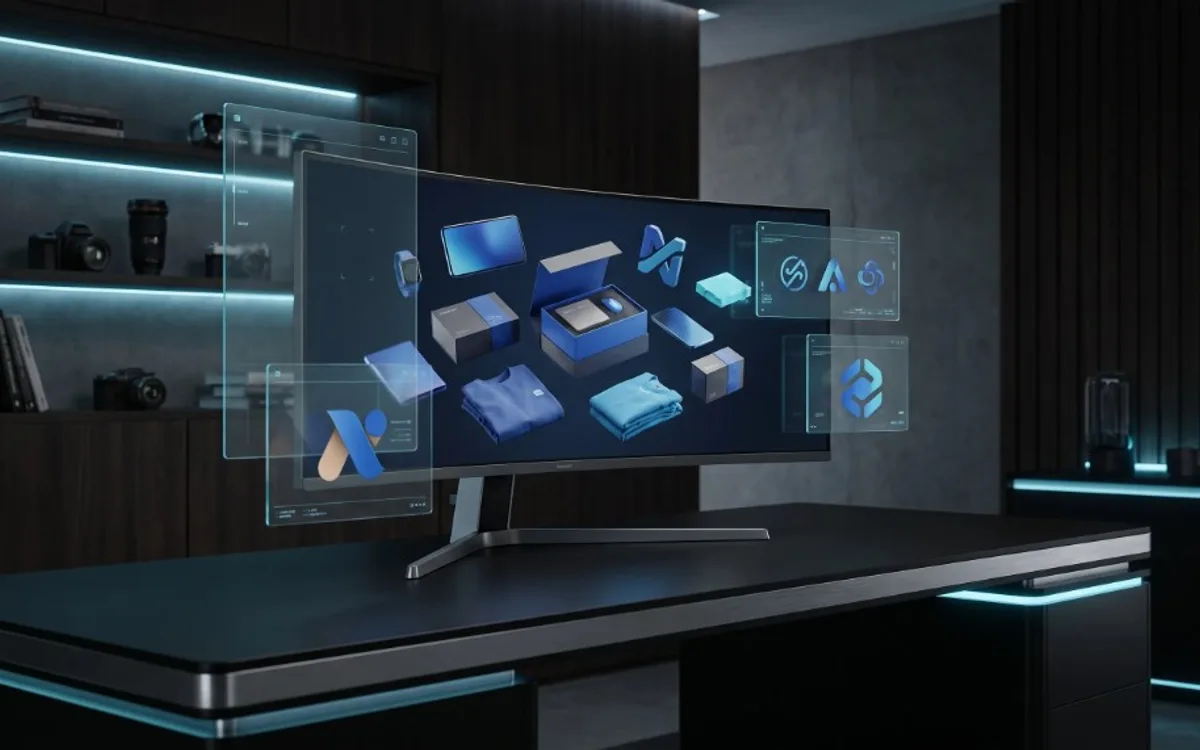
Showcase app designs by placing screens inside realistic device frames, showing more than one screen to convey the flow, and using motion only where a static image can’t explain an interaction. Keep the background simple and the styling consistent across every screen so the presentation looks intentional rather than random. Match the format — static or animated — to the platform where the showcase will actually be seen.
Put It in Context, Not on a Blank Canvas
A flat screenshot floating on a white background rarely does an app justice. Interfaces are meant to be held, tapped, and scrolled — showing them inside a device frame, or in a scene that resembles real use, immediately makes the design feel tangible rather than theoretical.
This doesn’t mean every showcase needs an elaborate scene. Even something simple — the screen placed inside a clean phone mockup, centered on a soft background — goes a long way compared to a bare rectangle of pixels.
Show More Than One Screen
A single static screen tells only part of the story. Most apps are experienced as a flow — a user opens the app, taps something, moves to the next screen, completes an action. Showing a sequence of screens (or a short animated transition between them) communicates that flow far better than one isolated image.
This is especially useful for onboarding flows, checkout processes, or any feature where the sequence matters as much as the individual screen design.
Use Motion When It Adds Clarity
Static mockups are great for quick, at-a-glance presentation. But some things are genuinely hard to communicate without movement — a swipe gesture, a transition animation, a loading state, a menu that expands. In these cases, a short motion mockup communicates in seconds what would take several static images (and a lot of arrows and captions) to explain.
The goal isn’t to add motion for the sake of looking impressive — it’s to use it specifically where a static image would leave the viewer guessing.
Keep the Background Simple
It’s tempting to add elaborate scenes, props, or busy backgrounds to make a showcase feel more “designed.” In practice, the opposite is usually true. A clean, simple background keeps all the attention on the actual interface, which is the whole point of the showcase. Save the more elaborate scenes for marketing pieces where the product itself is secondary to the mood being created.
Be Consistent Across Multiple Screens
If you’re showcasing several screens or an entire app, keep the framing, lighting, and background consistent across all of them. Inconsistent presentation — different device colors, different angles, different lighting — makes a showcase feel disjointed even if every individual screen looks great on its own. Consistency is often what separates a showcase that feels professional from one that feels like a random collection of images.
Think About Where It Will Be Seen
A showcase built for a portfolio page can afford more detail and multiple angles, since people will spend real time looking at it. A showcase built for a social media post needs to communicate its point in the first second or two, since it’s competing with everything else in someone’s feed. Design the showcase for the platform it will actually live on, not just for how it looks in isolation.
Export in the Right Format
Once the showcase is built, exporting it correctly matters just as much as designing it. A still image with a transparent background can be dropped onto any webpage or slide without an ugly box around it. A short looping animation works well for social feeds where things autoplay. Matching the export format to where the showcase will actually be used avoids a lot of avoidable friction later.
Frequently Asked Questions
What’s the biggest mistake when showcasing an app design?
Showing a flat screenshot without context. A device frame that mimics real use makes the design look finished instead of like a rough draft.
Should every screen use motion?
No. Use motion only when a static image can’t explain something, like a swipe, transition, or loading state. Overusing motion works against clarity.
How many screens should a showcase include?
Enough to show the flow that matters — usually two to four screens for an onboarding sequence or a key user action, not the entire app.
Does the export format matter for an app design showcase?
Yes. A still image with a transparent background drops cleanly onto any page, while a short looping animation works better for social feeds where content autoplays.
What These Habits Add Up To
Showcasing an app design well comes down to a few consistent habits: give it context, show the flow rather than just a single frame, use motion only where it adds real clarity, and keep the presentation clean and consistent. None of this requires elaborate production — it just requires treating the presentation with the same care as the design itself.